
7 Best Web3 Analytics Portfolios to Study

Vincent Charles
August 4, 2026 · 12 min read

TL;DR:
- A portfolio is evidence you can turn onchain mess into a decision, not a gallery of clean charts.
- The strongest proof is work someone else adopted and kept running.
- Publishing an honest investigation beats fifteen polished queries nobody can verify.
A Web3 portfolio is not a gallery of polished dashboards. It is evidence that you can turn messy onchain activity into a decision a product, growth, risk, or executive team can act on. The best web3 analytics portfolios make that evidence easy to inspect. They define the question, show the logic, state the limitations, and reach a conclusion with commercial relevance.
That standard matters because Web3 data work is unusually easy to make look impressive without making it useful. A chart of daily transactions can be visually clean and analytically empty. A wallet cohort analysis can be technically sophisticated while missing the product behavior that actually drives retention. Hiring managers and protocol leaders are looking for judgment, not SQL output.
What separates the strong ones
Strong portfolios consistently answer four questions. What decision is being supported? What is the metric definition? How was the data modeled or attributed? What should the team do next?
Answering those demonstrates more than dashboard fluency. It shows you understand event-level chain data, entity ambiguity, token incentives, contract changes, and the difference between activity and value. For senior roles that is the baseline, not the differentiator.
The work also has to be reproducible enough to trust. You do not need to publish every query, but a reader should be able to follow the analytical path. Name the chain and contracts, explain the time window, identify key joins or labels, state where attribution is uncertain. In onchain analytics, caveats are not weakness. They are part of the analysis.
The principle I hold my own published work to is simple: every number should be a public query someone can fork and verify against the chain, not a figure I am asking you to take on faith. If a reader cannot check it, it is a claim rather than an analysis.
And the highest bar, the one almost nobody writes about: did anyone else adopt it and keep running it. A dashboard the protocol team took over and now maintains is worth more than any amount of polish, because it proves the work was useful to someone with no obligation to be polite about it.
Seven patterns worth studying
The right portfolio depends on the role you want. An analyst targeting a DeFi protocol should not present the same body of work as a data engineer targeting an exchange or a compliance analyst at an institution. These seven recur because each maps data work to a real operating need.
1. The protocol KPI teardown
Start with a protocol and build a measurement framework around how it actually creates value. Rather than defaulting to TVL and transaction counts, separate leading from lagging indicators: activated wallets, repeat users, liquidity quality, fee generation, volume concentration, liquidation behavior, borrower retention.
The strongest versions define terms precisely. "Active user" might mean a wallet that completed a qualifying action through a specified set of contracts, not any address that touched the chain. The analysis should explain why that definition matches the business model.
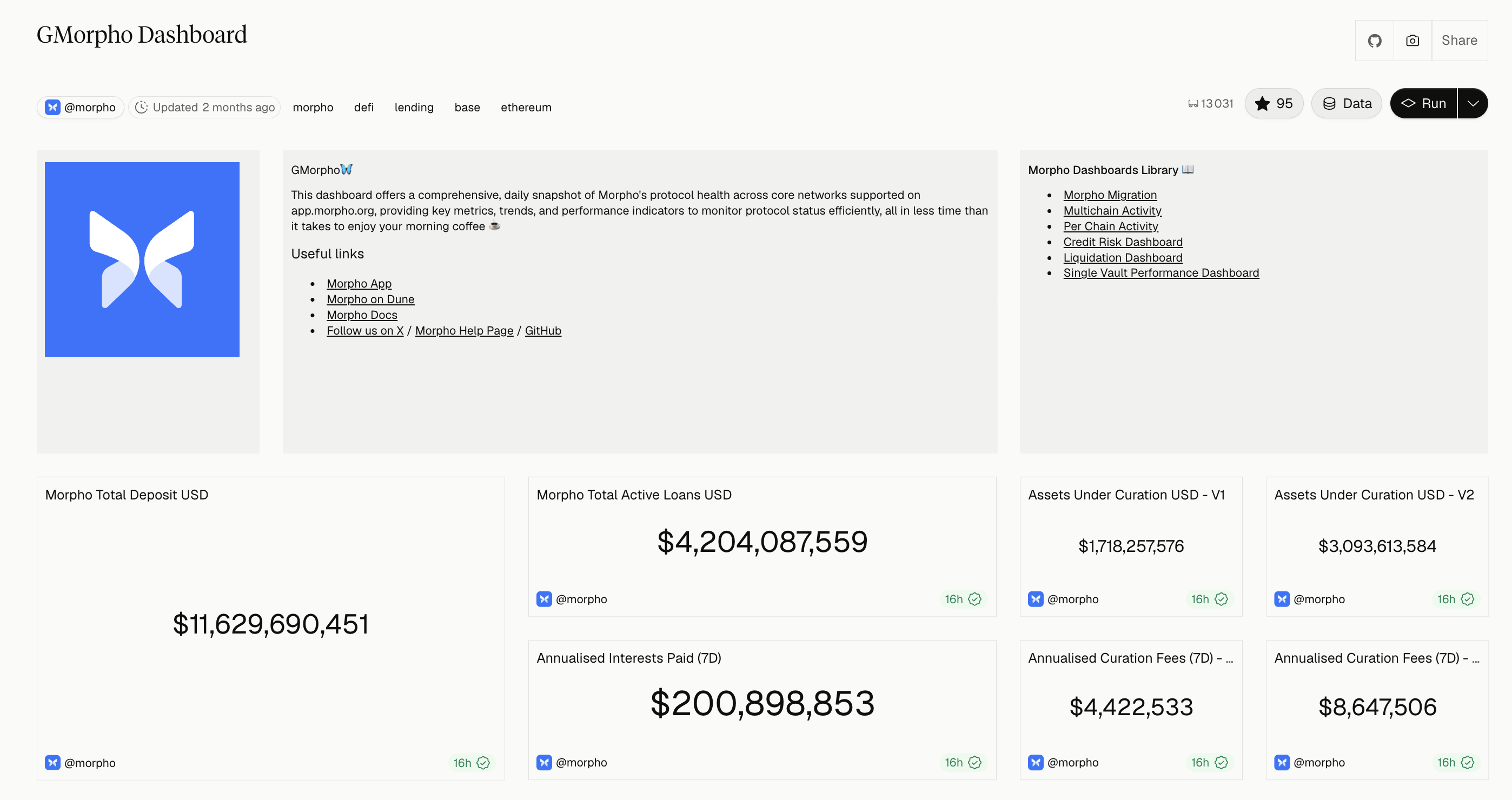
This is the best format for analysts and aspiring data leads because it reveals KPI judgment. GMorpho, which I built as Morpho's data lead, is this pattern in production. The design constraint was a read on protocol health in under a minute, which forces exactly the prioritization the format is testing for.
2. The wallet cohort and retention analysis
Web3 teams routinely report wallet counts as if they were customer counts. A good cohort project shows why that fails. Segment wallets by first meaningful action, then measure return behavior weekly or monthly. Compare by acquisition source, transaction type, chain, asset, or deposit size where the data supports it.
The critical work is defining a meaningful return. A wallet that claims an incentive once is not the same as one that comes back to swap, borrow, or provide liquidity. Make that distinction explicit and explain how sybil behavior, bots, and multi-wallet users distort the result.
Finish with an action. Maybe one activation path produces stronger 30-day retention. Maybe a campaign drove first transactions with no durable use. That is what a growth team can act on.
3. The attribution or data-integrity investigation
Cross-chain growth is frequently overstated, because the same user bridges assets, deploys new wallets, and interacts through aggregators. This pattern tackles identity and attribution head on.
A credible investigation does not claim perfect wallet-level identity resolution. It lays out a confidence-based method: direct bridge flows, known entities, temporal transaction patterns, shared funding behavior, labels from trusted sources. It separates observed fact from inference.
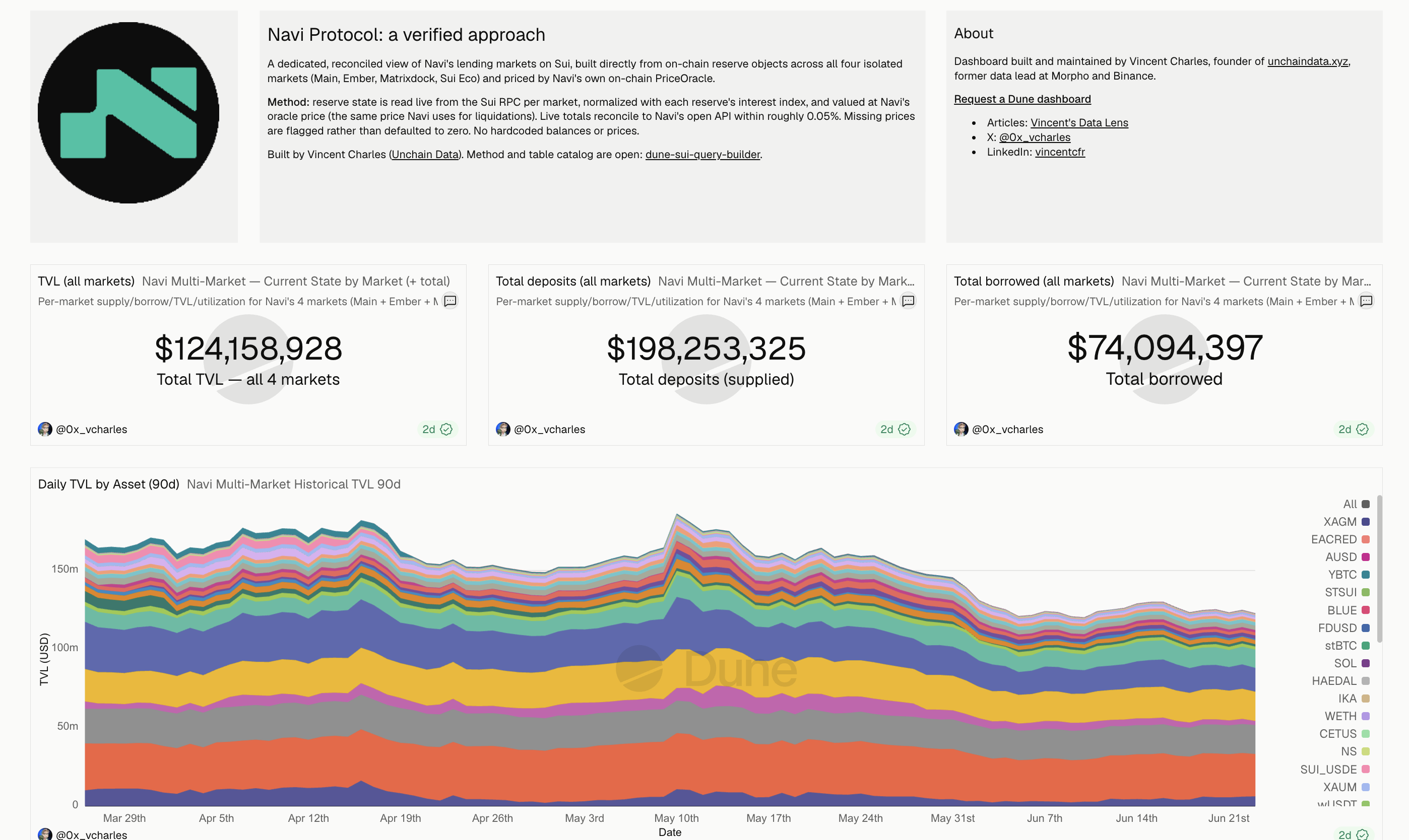
The stronger version of this pattern goes after the integrity of a number everyone already trusts. That is the Navi verified dashboard, and it is worth its own section below.
4. The liquidity and market structure dashboard
For DeFi, liquidity is more than TVL. Examine depth near the market price, concentration among providers, turnover, incentives, price impact, and how durable liquidity is after emissions change.
This works well for roles at DEXs, lending markets, stablecoin issuers, and market makers. It forces you to connect raw events to market behavior and handle token price normalization, pool migrations, and contract upgrades.
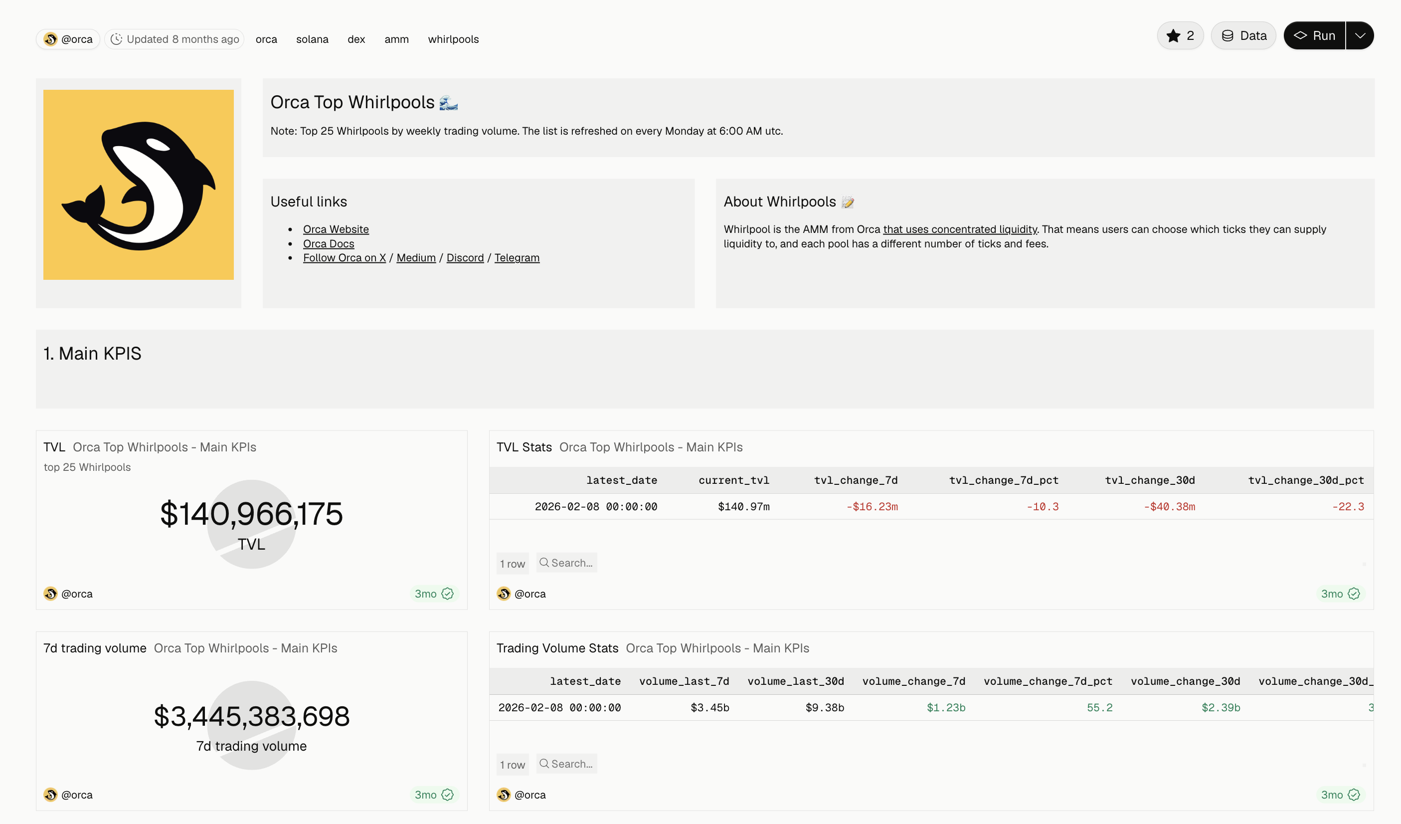
Avoid the static snapshot. The insight is in the change over time: which pools retain capital after rewards decline, where volume sits relative to depth, whether a few wallets control the apparent liquidity base. Orca Top Whirlpools is this pattern, tracking fee tiers, tick spacing, and LP concentration across the top 25 pools by weekly volume.
5. The product funnel built from contract events
A product funnel proves onchain data can answer product questions, not just market questions. Map a journey from a meaningful entry point through activation, a core action, and repeat use. For a lending protocol: connect or deposit, first borrow, position management, return borrowing.
The hard part is event taxonomy. Contract events do not arrive as a ready-made product analytics schema. Explain how you classified actions, handled failed transactions, excluded administrative activity, and joined offchain events where available.
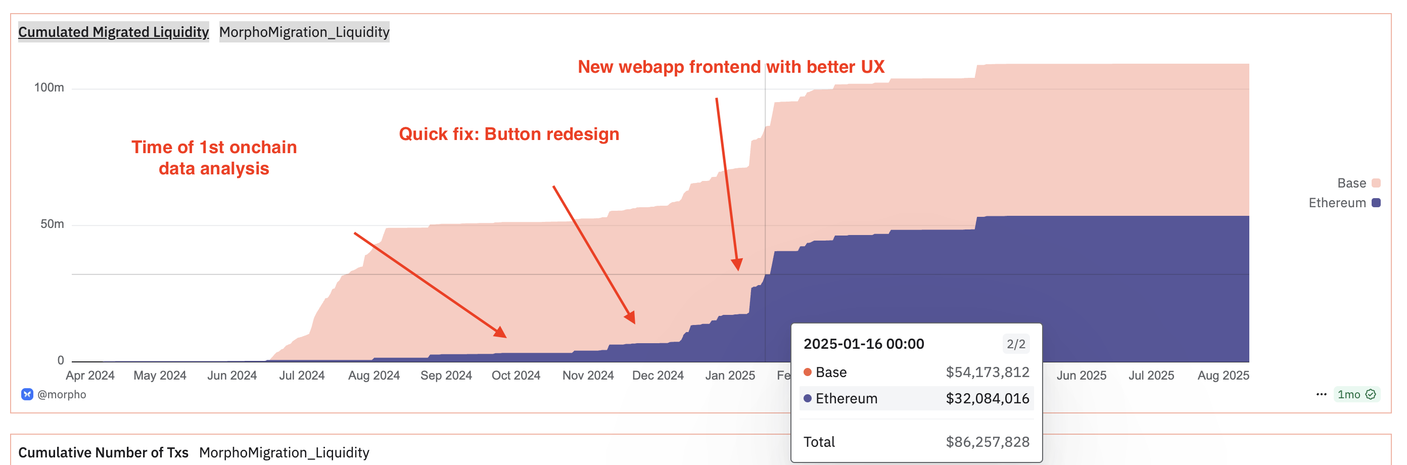
This is high signal for product analytics roles precisely because it exposes where onchain data runs out. That boundary is real and it is expensive. I have written about a case where the onchain number looked like success and the frontend told a completely different story, which is the failure mode this pattern is built to catch.
6. The risk, compliance, or treasury monitor
Not every valuable portfolio is growth-oriented. Risk analysis is central to exchanges, lenders, stablecoin teams, funds, and payment products. A strong project might monitor large exposure changes, collateral concentration, treasury runway, or counterparty dependencies.
The best examples avoid presenting labels as certainty. Sanctions exposure, entity ownership, and illicit-activity attribution require careful language and auditable methodology. State the source and confidence of labels, the alert thresholds, and the process a human reviewer would follow.
Suilend liquidations and bad debt is this pattern: a historical record of liquidation events, recovered value, and outstanding bad debt over time. I built it unprompted, which is the point of the section below.
For data engineers, go a level deeper and include the pipeline design: incremental ingestion, reorg handling, data quality checks, late-arriving labels, alert delivery. A working architecture diagram often persuades more than another dashboard tab.
7. The executive decision memo
Most portfolios stop at visualization. This one starts where dashboards should end: with a recommendation. Pick a real strategic question. Should a protocol renew a liquidity incentive program, prioritize a new chain, change a fee parameter, focus on a specific segment.
State the recommendation, quantify the trade-offs, show the evidence, and identify what you would monitor after implementation. If the answer is "do not act yet," explain what evidence is missing and how you would collect it.
This is the most senior format because it tests prioritization. Leaders do not need a dashboard for every metric. They need a trustworthy view of the few that change a decision.
What it looks like when a portfolio project works
Here is the clearest example I have, and it started as a weekend project.
I was rebuilding Navi's lending markets from raw on-chain state on Sui. My totals kept missing the dashboard everyone cites for Navi's TVL, so I assumed my reconstruction was wrong. It took going down to the actual package each query reads to find out what was happening. Mine was reading Navi's package. The most-cited one, 19 charts under the Navi name, was reading Suilend's.
The numbers on that dashboard were real. They were just a different protocol's. I cross-checked three ways before saying anything: Suilend's SDK, their open-source Move code, and DefiLlama.
It is an honest mistake and worth understanding why it happened. On Ethereum, lending events are already parsed for you. Sui gives you almost nothing for lending. As of mid-2026 there are five curated tables on Dune for Sui, and none cover multi-asset lending, so you rebuild supply, borrow, and price from raw state yourself. On a chain with no decoded tables, a dashboard's title is a claim rather than a guarantee, and almost nobody re-derives the package bytes to check.
The rebuild covered all four Navi markets, 48 reserves in total, priced from Navi's own on-chain oracle, the same one the protocol uses to decide liquidations. That is not an arbitrary choice. It means the dashboard agrees with the protocol by construction. It reconciles to Navi's live figures within 0.05% on supply and 0.008% on net TVL, with no third-party indexer and no hardcoded prices. Every row names its own price source, which is the column that makes the whole thing checkable.
Then the part that matters for anyone building a portfolio. Navi engaged with it and republished it from their main account. At the time of writing they were the largest Sui DeFi protocol by TVL, so that carried real visibility across the ecosystem. Nobody commissioned the work. It got picked up because it was correct and because the method was legible.
The full technical write-up, including why Navi and Suilend need completely different extraction paths, is in Sui Data 101: Reading the Bytes.
That is the whole argument for building in public. Pick a question a real team is struggling with, do it honestly, show your sources, publish it.
How to package the work
Each project should open with a short brief: business question, audience, data sources, time period, recommendation. Then the method and the output. A reviewer should get the project in under two minutes while still having enough detail to validate it.
Screenshots alone are weak evidence. Pair a dashboard with a written explanation of the metric layer, transformation choices, and edge cases. If you used SQL, dbt, Python, Dune, Allium, a warehouse, or a BI layer, name the tool only where it clarifies the implementation. Tools matter. Reasoning matters more.
Quality beats volume. Three developed case studies beat fifteen disconnected queries.
I have interviewed candidates, reviewed portfolios, and spent time helping analysts in the Bytexplorers, the onchain data community started by Andrew Hong. The thing that consistently makes me keep reading is not the chart. It is whether the person stated what they were unsure about. A portfolio that says "this attribution holds only for direct bridge flows, here is what I could not resolve" reads as someone who has done the work. A portfolio with no caveats anywhere reads as someone who has not yet hit the point where the data fights back.
Mistakes that undercut good work
The most common is treating wallets as people without qualification. Next is leaning on vanity metrics, raw transactions, TVL, followers, token price, without connecting them to business performance. Another is using labels or third-party estimates with no note on source and limitations.
Portfolios also lose credibility when charts have no definitions. If a metric cannot be reproduced from the description, it cannot be trusted in a decision meeting.
And do not hide an inconclusive result. A disciplined finding that a campaign produced no measurable retention lift is more useful than a confident narrative with nothing underneath it. The same applies to hardcoding. A missing price should break the row, not get filled with a stale constant. Fail loud.
Your next project does not need a novel dataset or a complex model. Pick a decision a real Web3 team is already struggling with, define the data honestly, and make the recommendation specific enough that someone could act on it next week.
If you are hunting for the roles this work is aimed at, we keep a live board of Web3 data jobs across analyst, engineer, scientist, and compliance tracks.
Key Takeaways
- A portfolio proves you can turn onchain mess into a decision. Polish is not the variable being tested.
- Every number should be a public query someone can fork and verify. If a reader cannot check it, it is a claim.
- The highest bar is adoption. Work a protocol team took over and kept running beats anything self-reported.
- Pick the pattern that matches the role: KPI teardown and cohorts for analysts, market structure for DEX and lending roles, risk monitors for exchanges and funds, decision memos for senior positions.
- Stating your uncertainty is a positive signal. A portfolio with no caveats reads as someone who has not hit the hard part yet.
- Unprompted work gets picked up when it is correct and legible. The Navi rebuild was a weekend project that the protocol republished.
- Fail loud rather than hardcoding. A missing price should break the row, not quietly become a stale constant.
If you are building toward one of these roles, browse open data analyst positions.
- Founder of Unchain Data
- Former data lead at Morpho Labs and Binance
- Builds Dune dashboards and data pipelines across Ethereum, Solana and Sui
- Advises VC funds and DeFi protocols on data strategy
- Featured on BBC for blockchain data research
Ready to practice what you just read?
WizardCamp has interactive SQL exercises on real blockchain data. Write queries, get instant feedback, earn certificates.
Explore WizardCamp